BLOG
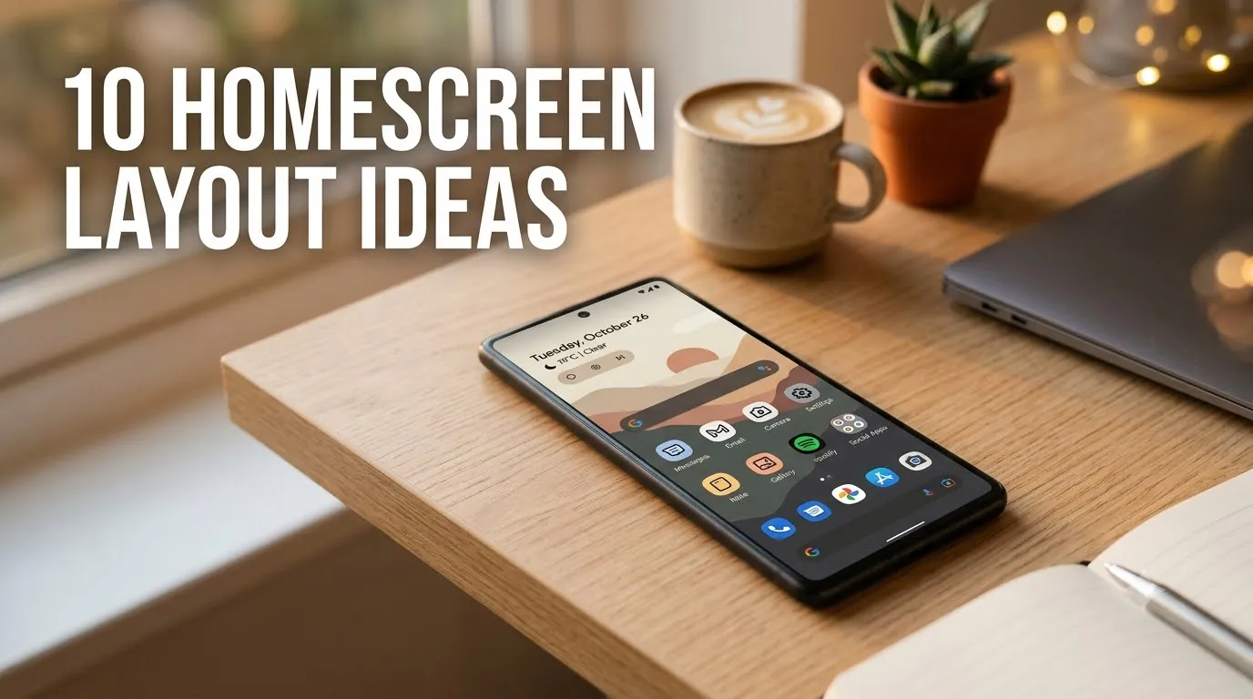
10 Homescreen Layout Ideas
Introduction
Your phone’s home screen is something you probably look at hundreds of times every day, yet many people never take the time to make it feel organized, stylish, or personalized. A cluttered home screen filled with random apps, mismatched widgets, and scattered folders can make your device feel chaotic, even when everything technically works. On the other hand, a thoughtfully designed layout can create a more enjoyable experience every time you unlock your phone.
One thing I’ve noticed is that a well-organized home screen does more than just look pretty. It can improve productivity, reduce distractions, and help you find the apps you use most without endless scrolling. Whether you love minimalist aesthetics, cozy seasonal themes, modern layouts, or highly functional setups, there are countless ways to customize your screen to match your personality and lifestyle.
The best home screen designs balance style and usability. They create a clean visual flow while still keeping important apps and tools within easy reach. Small adjustments such as widget placement, icon organization, color coordination, and wallpaper selection can completely transform the look and feel of your device.
In this guide, you’ll discover inspiring homescreen layout ideas that combine beauty and functionality. From minimalist designs to aesthetic-themed arrangements, these layouts can help you create a phone setup that feels both practical and visually appealing. Whether you’re refreshing your current design or starting from scratch, these ideas will help you build a home screen you’ll actually enjoy using every day.
Table of Contents
1. Minimal Grid
A clean and balanced arrangement that keeps apps organized and distraction-free.
2. Neutral Aesthetic
Soft colors and calming visuals create an elegant everyday setup.
3. Widget Focus
Large widgets become the centerpiece while reducing app clutter.
4. Color Organized
Apps are grouped by color for a visually satisfying layout.
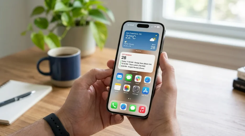
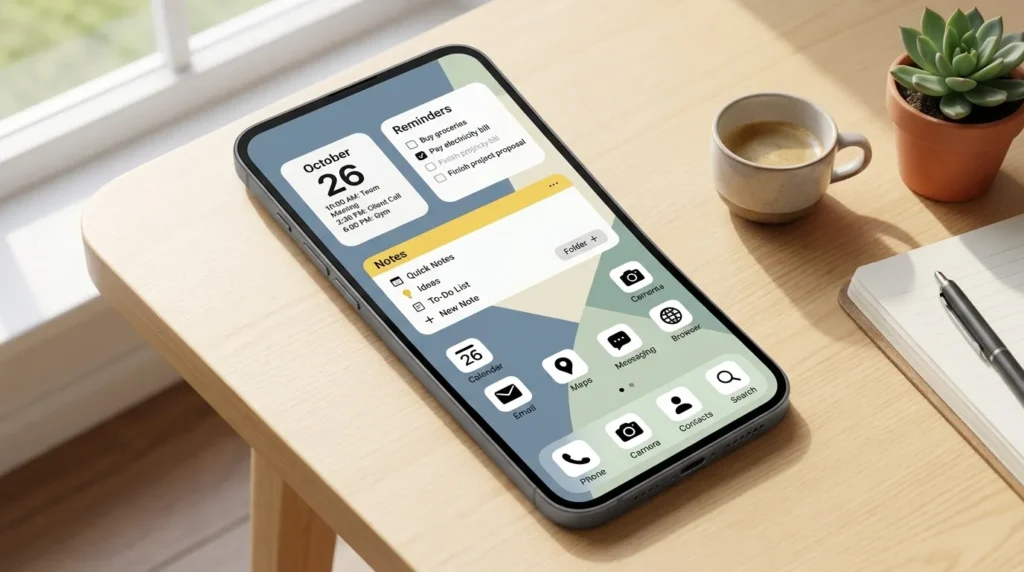
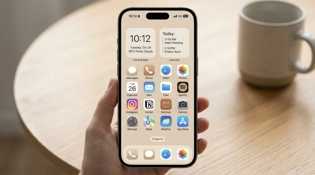
5. Productivity Hub
Quick access to calendars, notes, and task management tools.
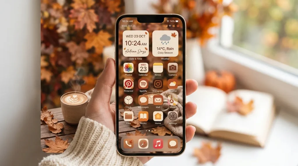
6. Cozy Autumn Theme
Warm seasonal colors create a comforting and inviting screen.
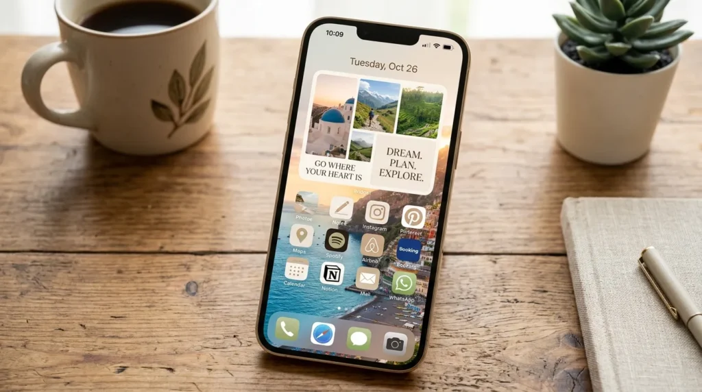
7. Vision Board Style
Inspirational images and widgets create daily motivation.
8. Symmetrical Layout
Balanced placement creates a polished and professional appearance.
9. App Drawer Setup
A minimalist home screen with most apps hidden away.
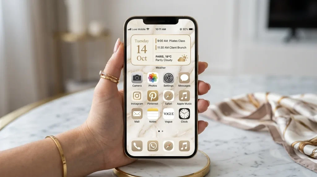
10. Luxury Neutral
Sophisticated colors and elegant widgets create a premium look.
1. Minimal Grid
Quick Benefits
- Cleaner appearance
- Faster navigation
- Less visual clutter
- Easier app access
- Timeless design
Why It Works
A minimal grid layout remains one of the most popular homescreen designs because it creates immediate visual order. By limiting the number of apps displayed on each page, your screen feels less overwhelming and more intentional. Many people find that removing unnecessary icons helps them focus on the apps they truly use every day.
The structured appearance also makes navigation easier. Instead of searching through multiple pages, your most important apps remain visible and accessible. This simple organization method works well with nearly any wallpaper style, making it a versatile choice for both Android and iPhone users.
How To Style It
Start by selecting only your most-used apps for the first screen. Place them in evenly spaced rows and keep widget usage minimal. Choose a simple wallpaper with soft tones or neutral colors to maintain a clean aesthetic.
If desired, use matching app icons to create a more cohesive appearance. Avoid overcrowding the screen and leave some negative space to enhance the minimalist look.
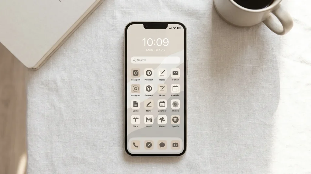
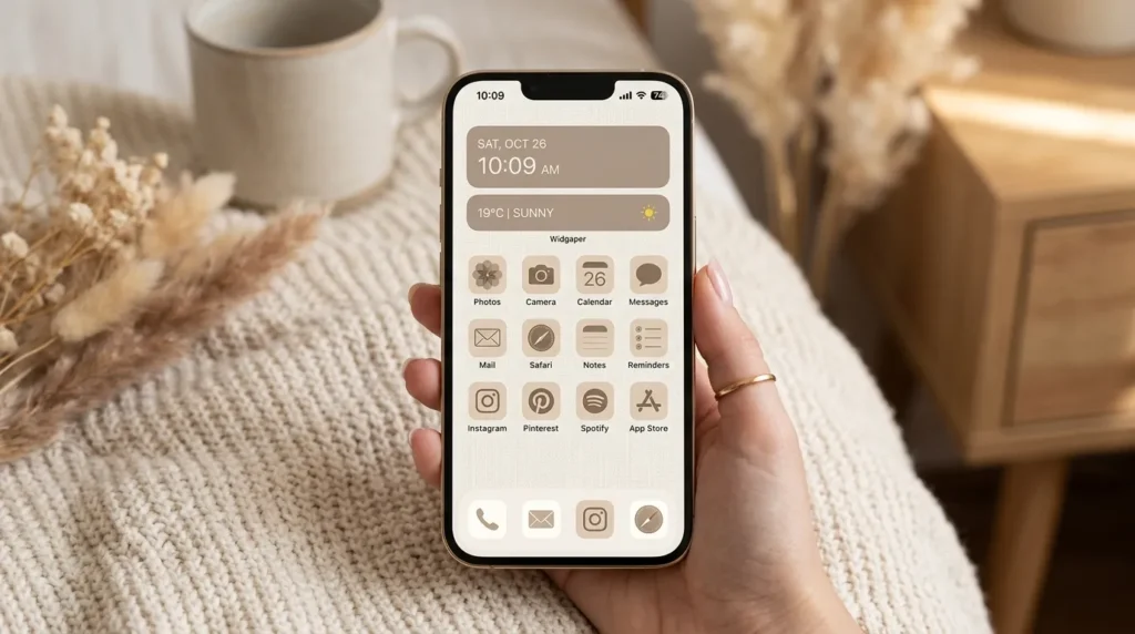
2. Neutral Aesthetic
Quick Benefits
- Calm visual appearance
- Elegant styling
- Easy to customize
- Reduces screen clutter
- Matches many wallpapers
Why It Works
Neutral tones create a relaxing digital environment that feels timeless rather than trendy. Beige, cream, taupe, soft gray, and muted brown shades work especially well because they reduce visual noise while maintaining a polished appearance.
Many Pinterest users gravitate toward neutral aesthetics because they complement modern home decor trends and lifestyle content. The simplicity allows widgets, icons, and wallpapers to work together without competing for attention.
How To Style It
Choose a wallpaper featuring soft neutral tones, textured fabrics, cozy interiors, or minimalist artwork. Pair it with matching widgets and custom icons in beige, cream, or muted gray.
Keep folders organized and avoid bright accent colors. Consistency is key to achieving a refined and cohesive aesthetic.
3. Widget Focus
Quick Benefits
- More functionality
- Faster information access
- Personalized design
- Modern appearance
- Improved productivity
Why It Works
Widgets provide valuable information at a glance without requiring you to open multiple apps. Weather updates, calendars, reminders, fitness tracking, and photo widgets can make your home screen more useful throughout the day.
Large widgets also create strong visual structure. Instead of a screen packed with icons, widgets introduce hierarchy and balance, making the overall design feel more intentional and organized.
How To Style It
Select two or three primary widgets that support your daily routine. Arrange them vertically or stack them strategically to maintain visual balance.
Use widget colors that coordinate with your wallpaper and limit the number of visible apps to prevent clutter.
4. Color Organized
Quick Benefits
- Visually satisfying
- Easy categorization
- Creative design
- Personalized appearance
- Fun customization
Why It Works
Color-based organization transforms your home screen into a visually engaging display. Grouping apps according to icon colors creates a rainbow-inspired effect that feels both artistic and functional.
This approach also helps create stronger visual consistency across the screen, especially when paired with coordinated wallpapers and widgets.
How To Style It
Arrange apps into color groups from light to dark or rainbow order. Use matching folders and simple widgets to maintain balance.
Choose a neutral wallpaper that allows the colorful icons to stand out without overwhelming the overall design.
5. Productivity Hub
Quick Benefits
- Better organization
- Increased efficiency
- Faster task management
- Reduced distractions
- Daily planning support
Why It Works
A productivity-focused layout places your most important tools front and center. Calendars, reminders, notes, email, and task management apps remain easily accessible, helping you stay organized throughout the day.
I’ve noticed that people who use their phones for work often benefit from layouts that reduce unnecessary distractions and prioritize functionality over decoration.
How To Style It
Position a large calendar widget at the top and place task-management apps nearby. Keep social media apps on secondary pages to minimize interruptions.
Use clean typography and simple wallpapers to maintain focus.
6. Cozy Autumn Theme
Quick Benefits
- Seasonal charm
- Warm color palette
- Inviting appearance
- Pinterest-worthy aesthetic
- Easy customization
Why It Works
Seasonal themes help your phone feel fresh and updated throughout the year. Autumn-inspired layouts create warmth through earthy colors, cozy imagery, and rich seasonal textures.
The combination of warm oranges, soft browns, cream tones, and subtle gold accents creates a comforting visual experience every time you unlock your phone.
How To Style It
Choose wallpapers featuring fall leaves, cozy coffee scenes, knit textures, or autumn landscapes. Pair them with warm-toned widgets and neutral icons.
Small seasonal details can make the entire layout feel intentional and inviting.
7. Vision Board Style
Quick Benefits
- Daily inspiration
- Motivational reminders
- Personalized goals
- Creative appearance
- Positive mindset support
Why It Works
Vision board layouts combine aesthetics with motivation. By displaying inspirational quotes, personal goals, travel dreams, or wellness reminders, your home screen becomes a visual representation of what matters most to you.
Many users find that regularly seeing their goals encourages consistency and focus.
How To Style It
Use photo widgets featuring inspiring images, dream destinations, lifestyle goals, or motivational quotes. Pair them with clean icon layouts and minimal app clutter.
Maintain consistent colors to keep the design cohesive.
8. Symmetrical Layout
Quick Benefits
- Balanced appearance
- Professional design
- Easy navigation
- Clean structure
- Timeless style
Why It Works
Symmetry naturally feels pleasing to the eye. Balanced layouts create a sense of order that makes your screen look polished and intentional.
Equal spacing between widgets and icons helps maintain visual harmony while improving usability.
How To Style It
Center widgets and arrange icons evenly on both sides. Use matching icon sizes and maintain equal spacing throughout the screen.
Choose wallpapers with subtle patterns or clean backgrounds for maximum impact.
9. App Drawer Setup
Quick Benefits
- Extremely clean appearance
- Minimal distractions
- Better focus
- Faster access
- Modern aesthetic
Why It Works
Many users discover that hiding most apps inside the app drawer creates a cleaner and more calming experience. The first screen contains only essential tools, reducing visual clutter and temptation.
This setup supports digital minimalism while still providing access to every app when needed.
How To Style It
Display only a few essential apps alongside one or two widgets. Keep additional apps organized in the app drawer.
Use a simple wallpaper and leave plenty of empty space for a refined appearance.
10. Luxury Neutral
Quick Benefits
- Elegant design
- Sophisticated appearance
- High-end aesthetic
- Easy customization
- Timeless style
Why It Works
Luxury-inspired layouts combine soft neutral colors with refined design elements. Cream, taupe, black, and gold accents create a polished look that feels modern and upscale.
These layouts remain popular on Pinterest because they mirror current luxury interior design trends and premium lifestyle aesthetics.
How To Style It
Choose wallpapers featuring marble textures, elegant interiors, soft fabrics, or luxury-inspired imagery. Pair them with minimalist widgets and coordinated icons.
Maintain a restrained color palette for the most sophisticated result.
Frequently Asked Questions
What makes a good homescreen layout?
A good homescreen layout balances aesthetics and functionality. It should look visually appealing while making important apps easy to access. Organized widgets, consistent colors, and thoughtful spacing all contribute to a better user experience.
How many apps should be on a home screen?
Most users benefit from displaying only their most frequently used apps. Keeping between 8 and 16 visible apps often creates a cleaner and more organized appearance.
Are widgets useful for home screen design?
Yes. Widgets provide quick access to information such as weather, calendars, reminders, and photos. They also add visual structure and personality to a layout.
How can I make my home screen look aesthetic?
Choose a cohesive color palette, use matching widgets, select a high-quality wallpaper, and limit clutter. Consistency across icons and design elements helps create a polished look.
What is the most popular home screen style?
Minimalist and neutral aesthetic layouts remain among the most popular because they combine visual appeal with practical functionality.
Can seasonal themes improve my home screen?
Seasonal themes can make your device feel fresh and personalized throughout the year. Autumn, winter, spring, and summer designs are especially popular among Pinterest users.
Conclusion
Your home screen is one of the most frequently viewed spaces in your digital life, making it worth the effort to design thoughtfully. Whether you prefer a minimalist grid, a cozy autumn aesthetic, a productivity-focused setup, or a luxury neutral design, the right layout can make your phone feel more organized, efficient, and enjoyable to use.
The best designs balance beauty with functionality. Rather than overcrowding your screen with apps and widgets, focus on creating a layout that supports your daily routine while reflecting your personal style. Small adjustments such as reorganizing icons, choosing a new wallpaper, or adding a few well-placed widgets can dramatically improve the overall experience.
Start with one idea that fits your lifestyle and build from there. Over time, you’ll create a home screen that feels both practical and uniquely yours.
Related Articles
- 10 Fall Homescreen Ideas
- 10 Desktop Wallpaper Ideas
- 10 Autumn Wallpaper Ideas
- 10 Cozy Room Aesthetic Ideas
- 10 Lock Screen Ideas